Project Big Chill - A Kitchen and Dining Room Makeover
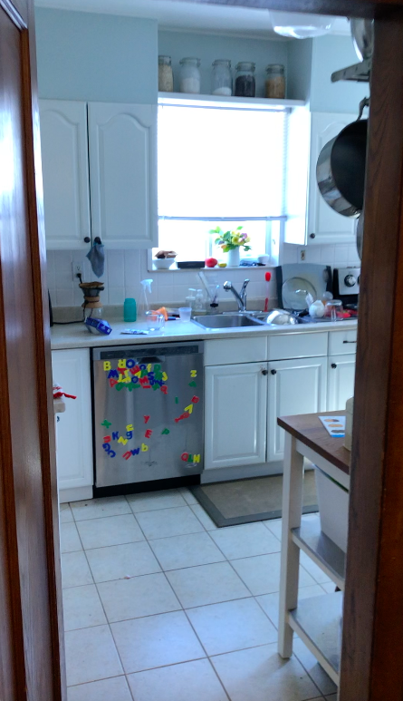
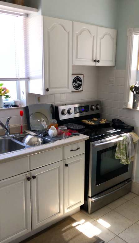
I’m passionate about kitchens. Like can’t get enough of every last detail, want to find a spot for every appliance and garbage can and dish a client owns, kind of passionate. So when our friends-turned-clients came to me to see if I could help them make their tiny and dated kitchen into a larger and much more useable space, I jumped at the opportunity. Let me show you what this space used to look like!
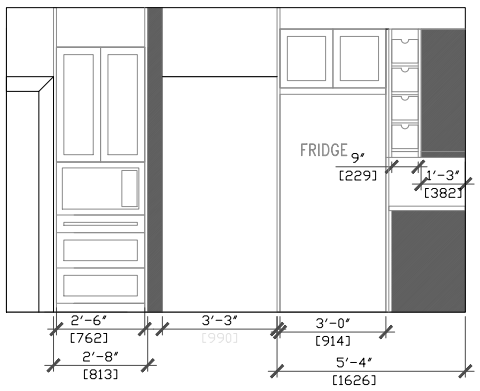
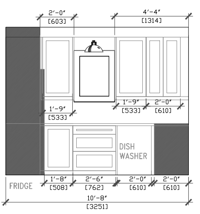
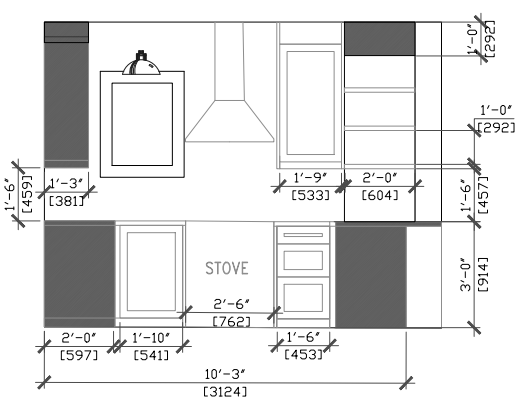
For starters, we worked with contractors The Brolaws to ensure the wall between the kitchen and dining room could be taken down. Thankfully that was a go and didn’t require too much moving around of HVAC or plumbing/electrical. Knowing it could be done, we worked on floor plans and elevations for the kitchen to make sure we could make it as functional as possible for this family of 5. Here’s where those plans took us:

Now let’s see the dining room before:
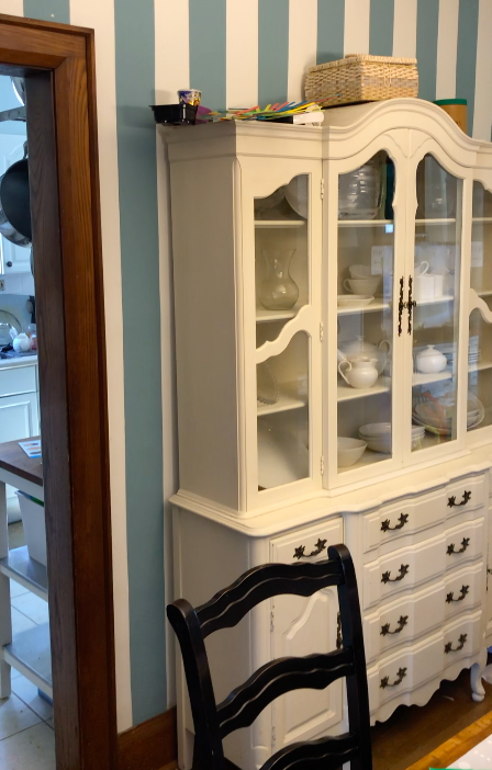
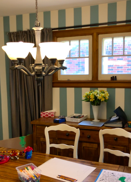
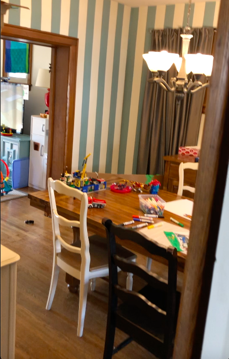
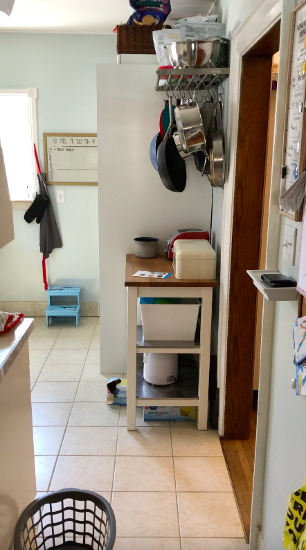
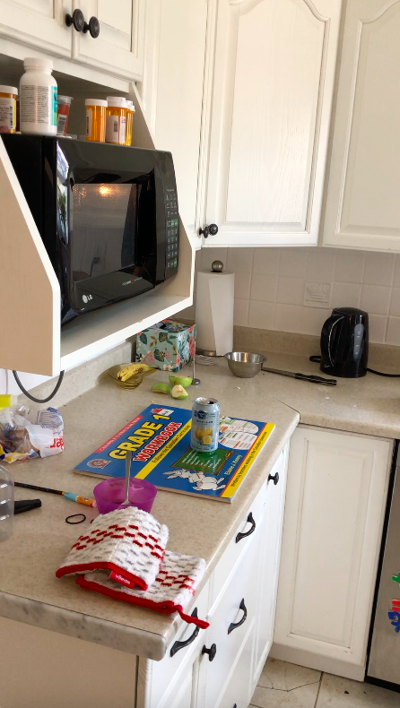
You can see based on these pictures that this family had to use a lot of furniture for storage because the kitchen just did not have enough.
Now let’s show you some of the progress!
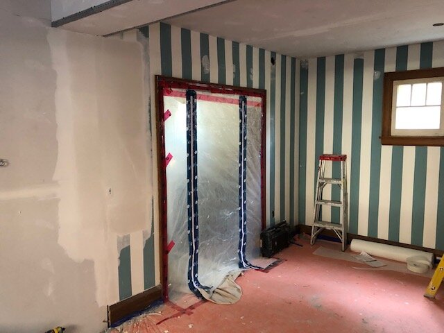
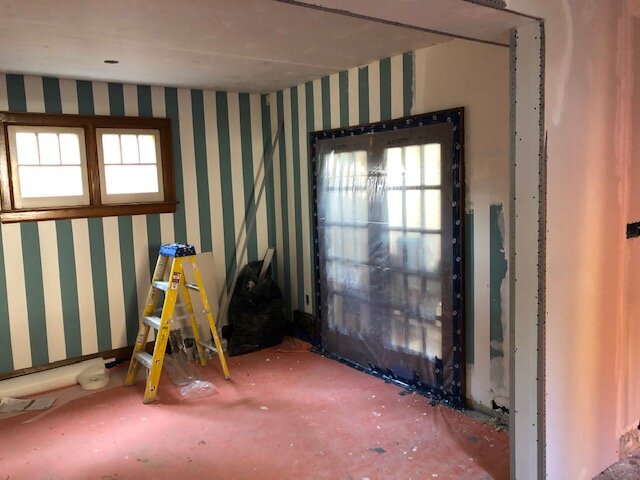
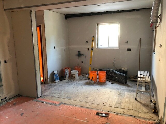
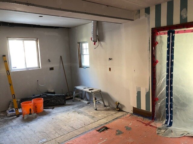
You can see we ended up with a bulkhead above where the peninsula will go, but were able to completely remove the ones above the previous cabinetry, which was a HUGE win and meant we could carry cabinets to the ceiling.
Alright, well, I’m sure you’re ready to see some ‘after’ photos, right? Let’s get to it!
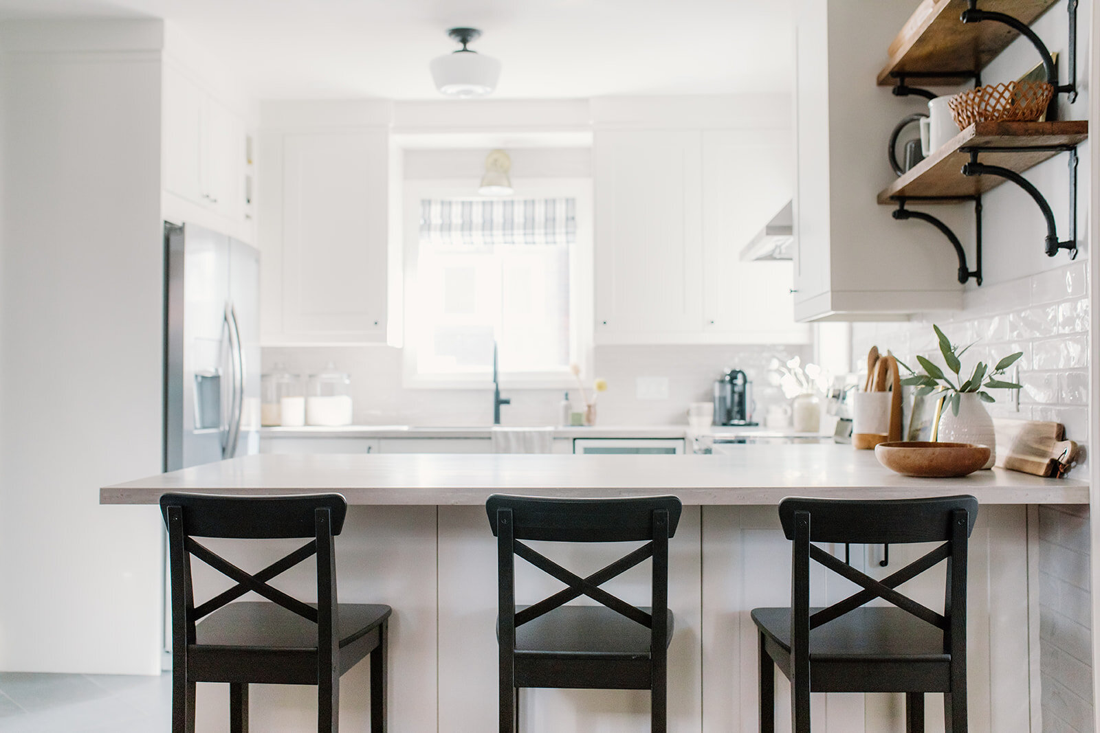
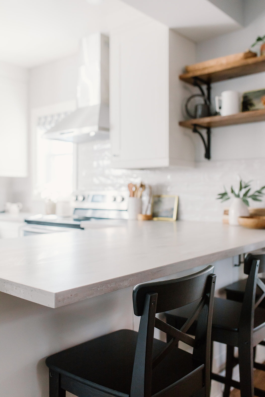
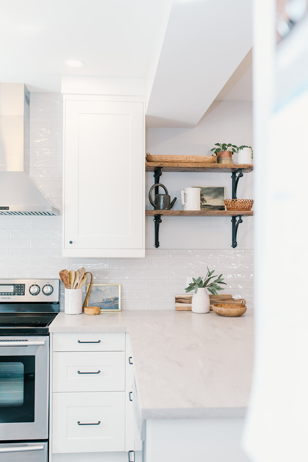
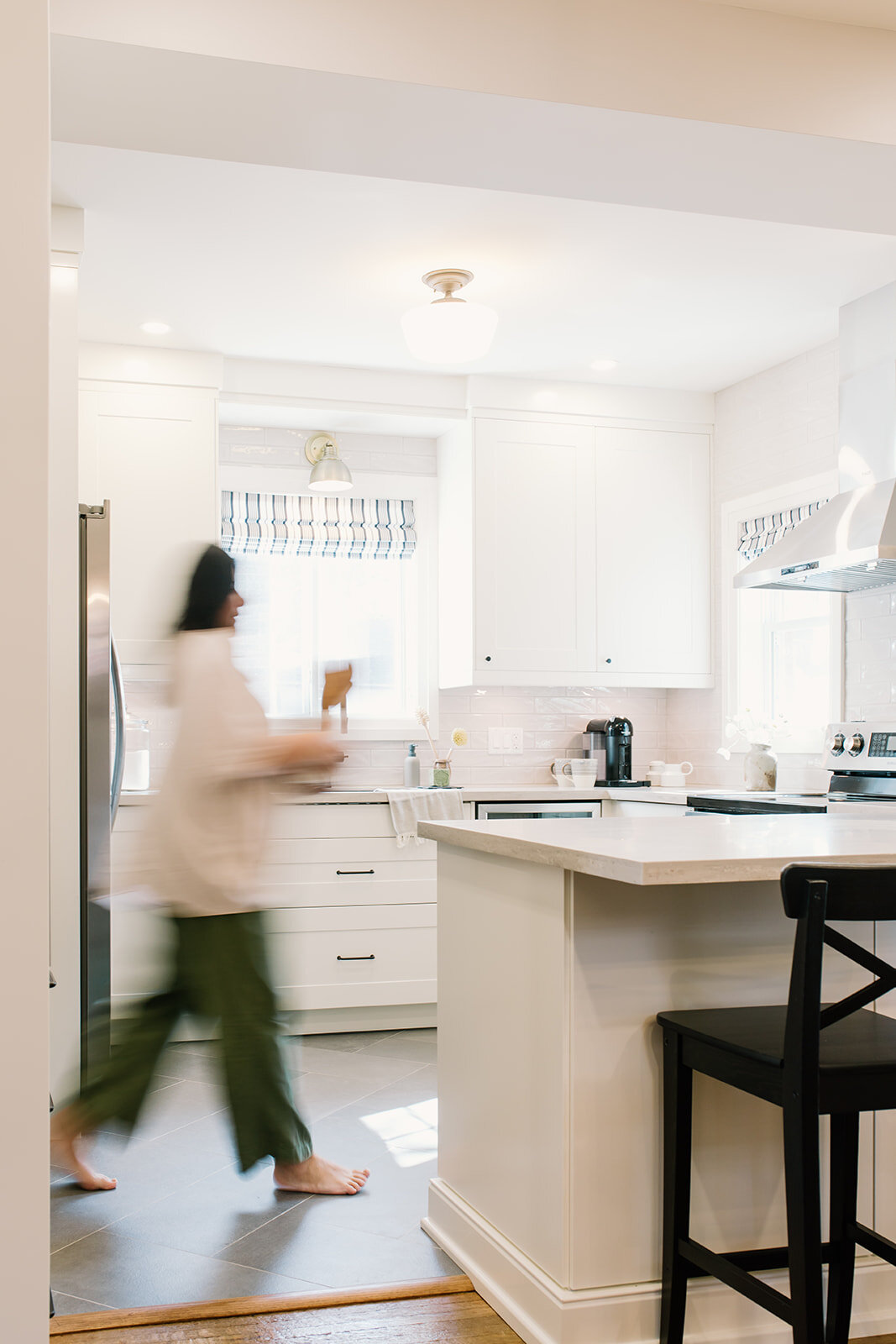
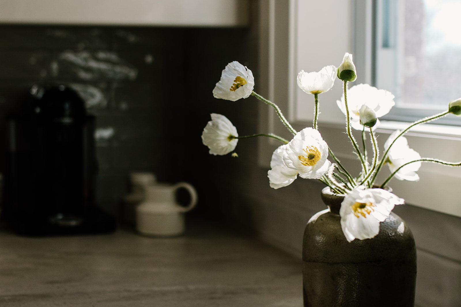
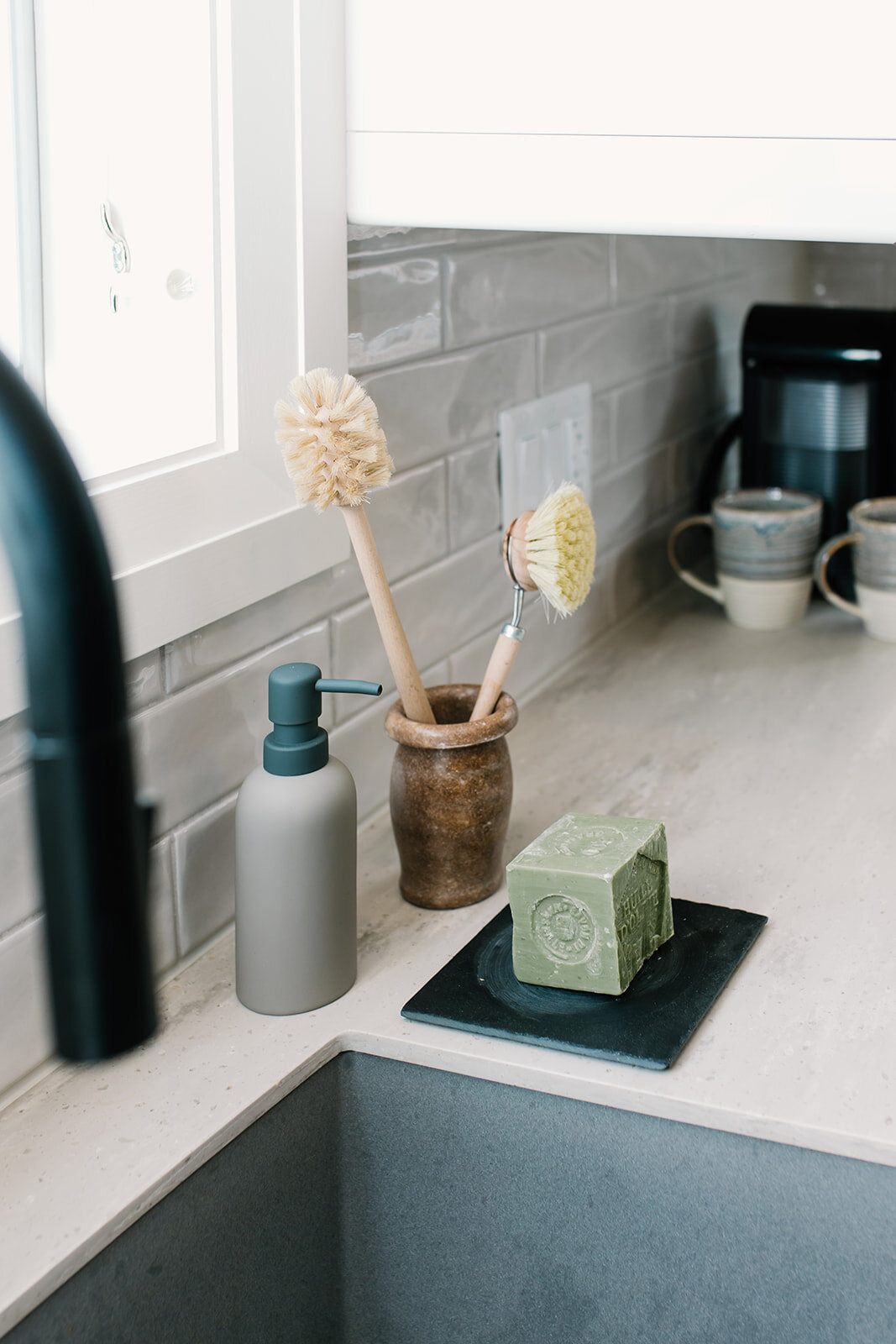
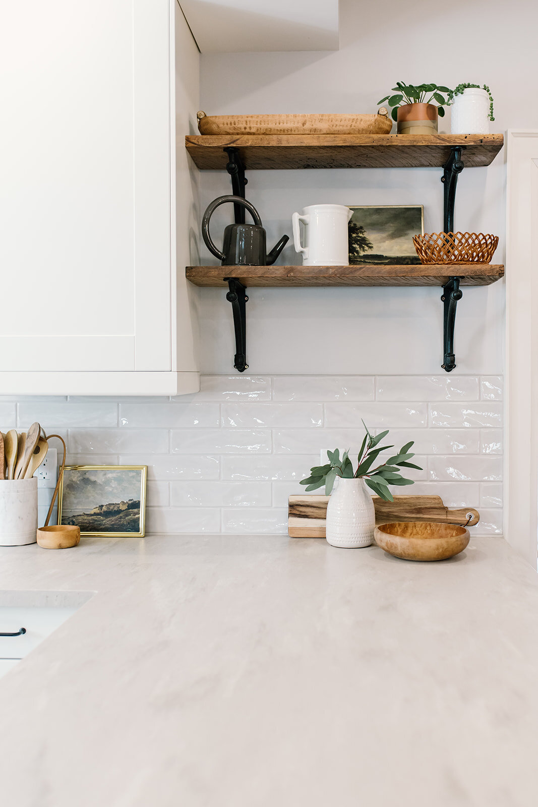
A few details you may notice about this kitchen are…
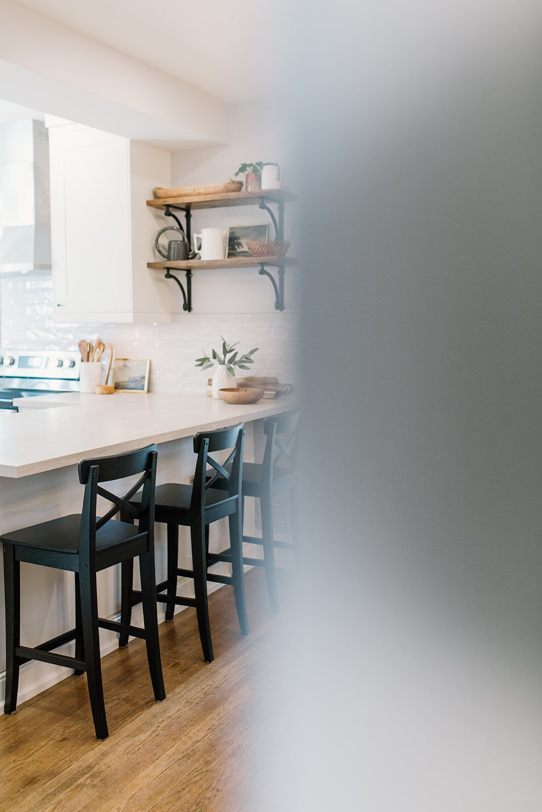
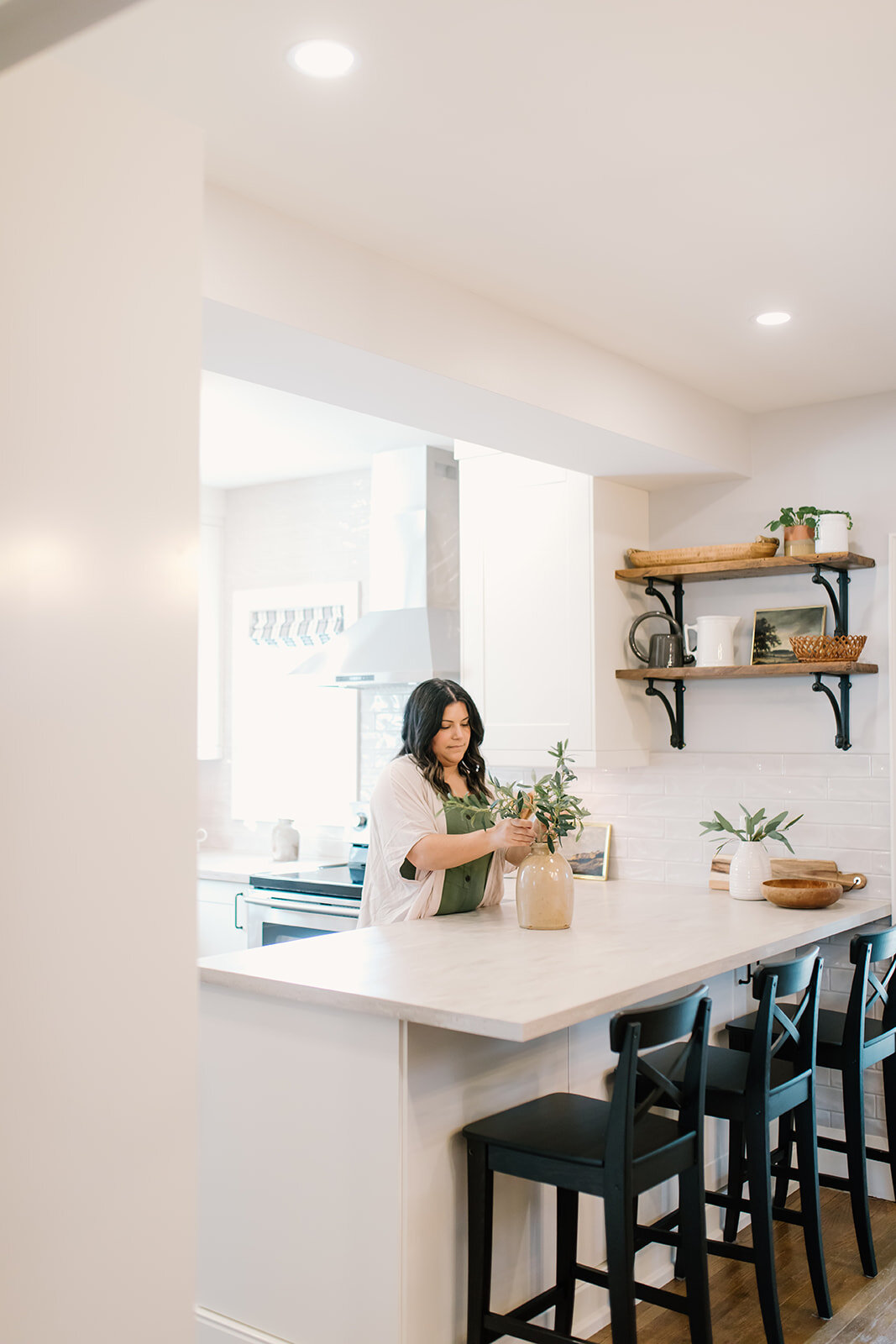
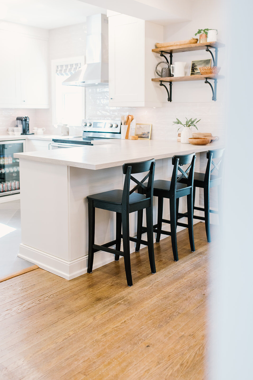
The floors! We chose to go with a herringbone pattern in a mid-grey porcelain tile that had some movement to it. This will hide crumbs well but also clean up easily. The home’s original hardwood floors begin at the peninsula, which creates a natural transition from ‘sitting area’ to the kitchen.
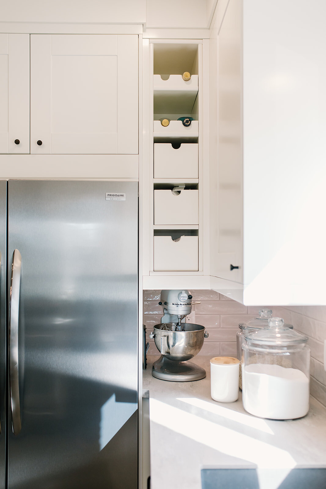
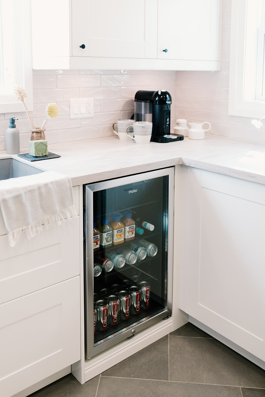
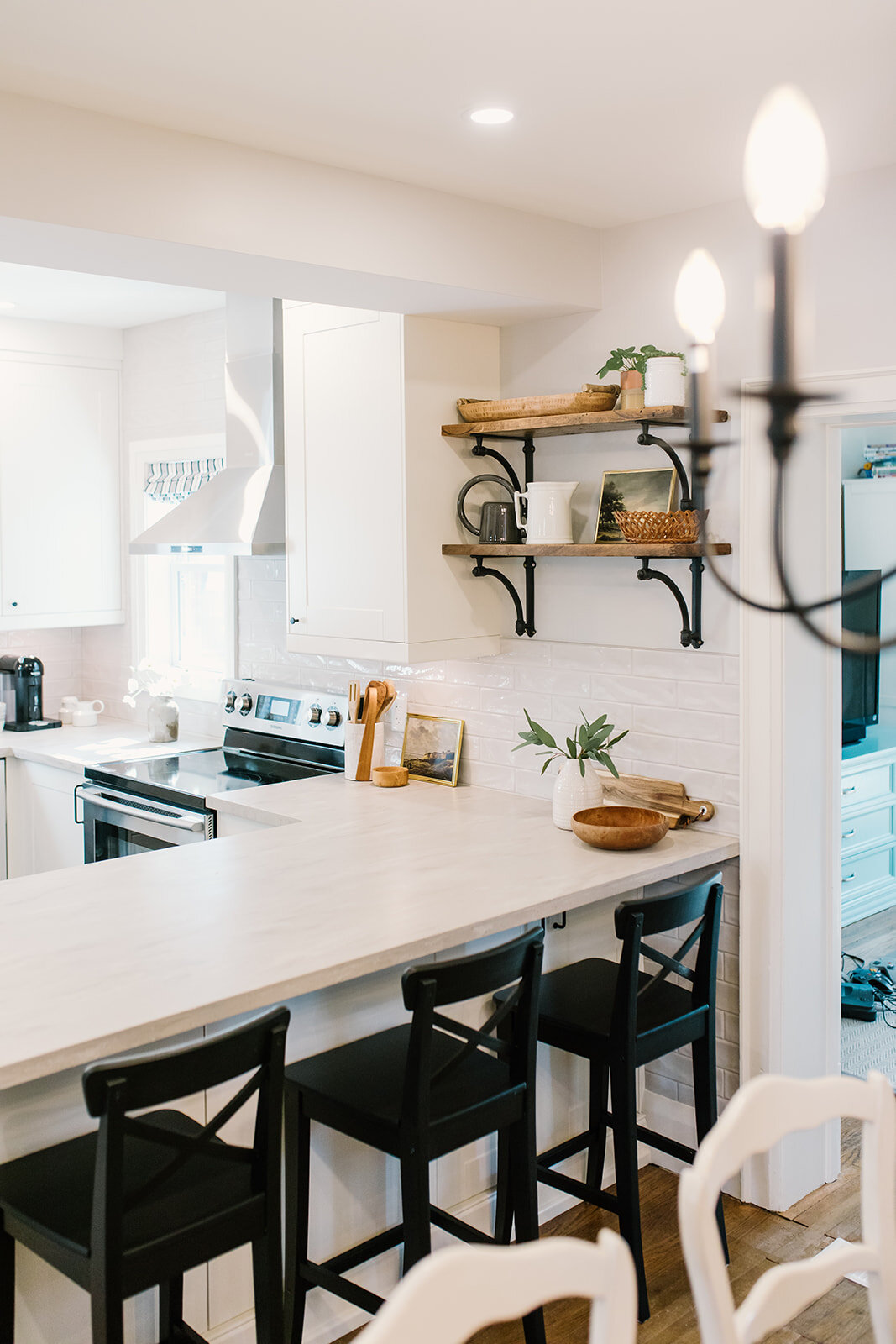
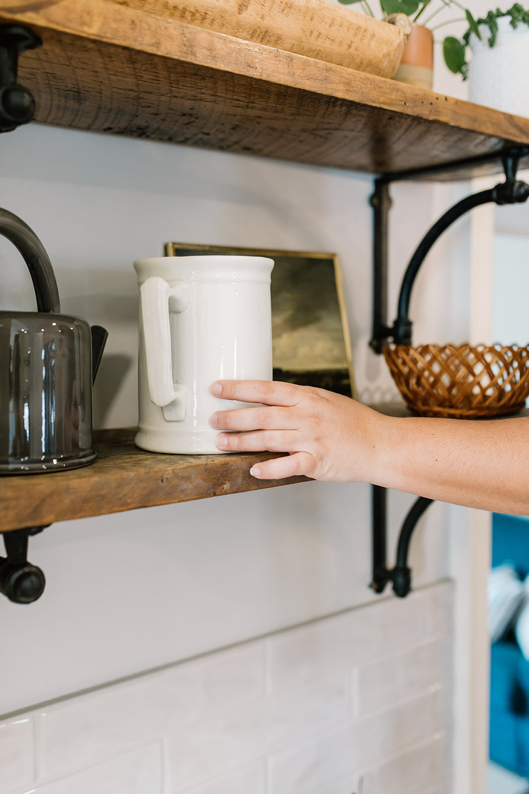
The cabinetry is actually IKEA, and we made it look as custom as possible by including some cubbies next to the fridge, adding crowns and fillers where needed and including a bar fridge built-in to the cabinetry. The open shelves allow for a little room for decor items and open the space up between the kitchen and dining room as well.
You might also notice we opted to have no pendants above the peninsula - an unusual design choice for sure, but this meant not drawing attention to the bulkhead and also keeping those two spaces as open to one another as possible. The kitchen does, however, have a flush-mount fixture (the owners’ original light") and a sconce above the sink window for some task lighting. There is also under-cabinet lighting, so we may not have pendants, but there’s no shortage of lighting options in this kitchen now!
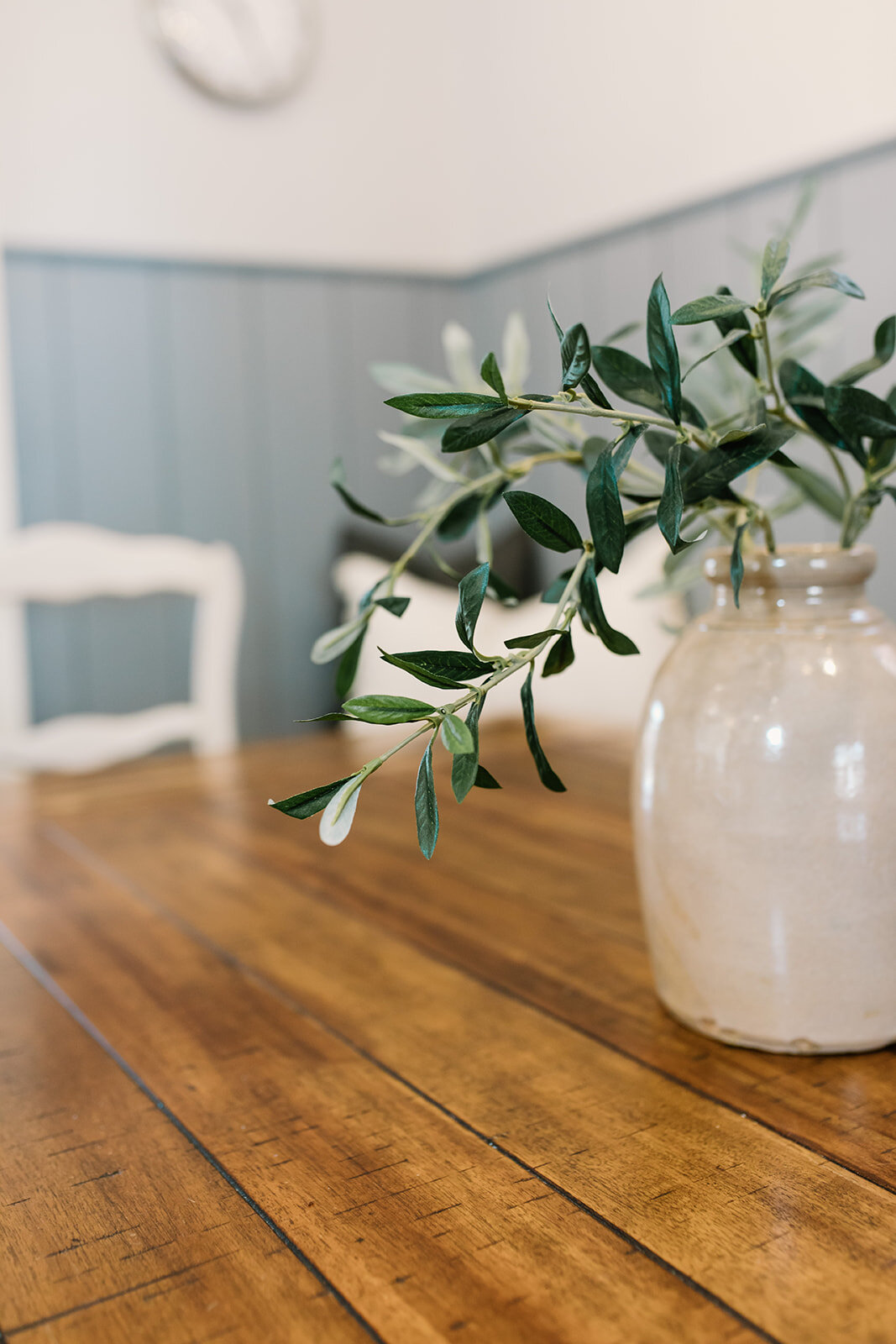
Ok, now let’s see the dining room!
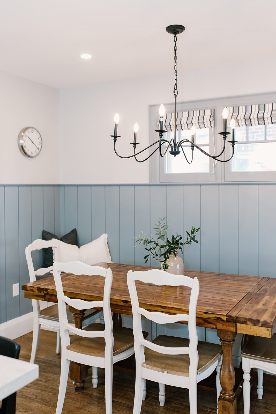
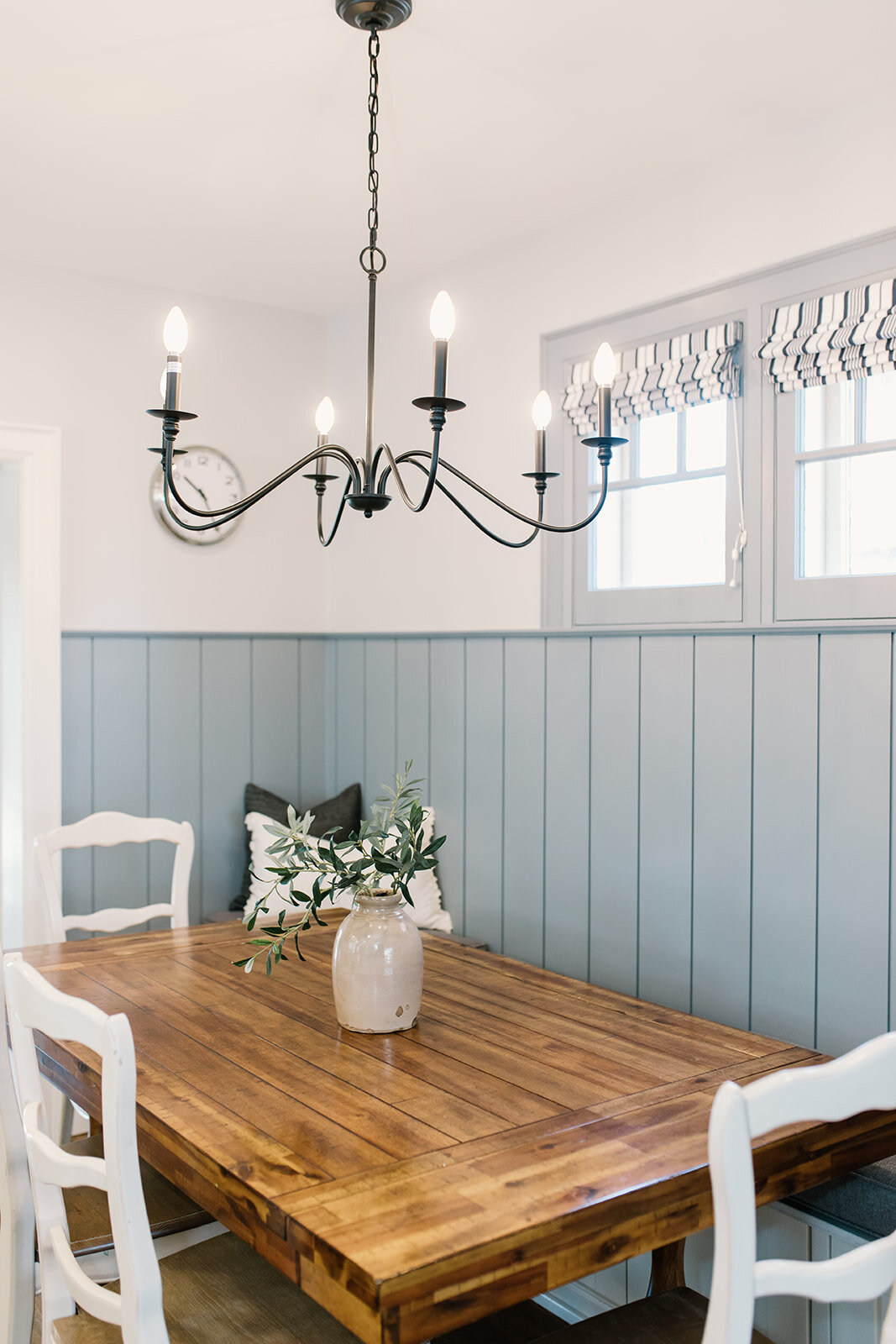
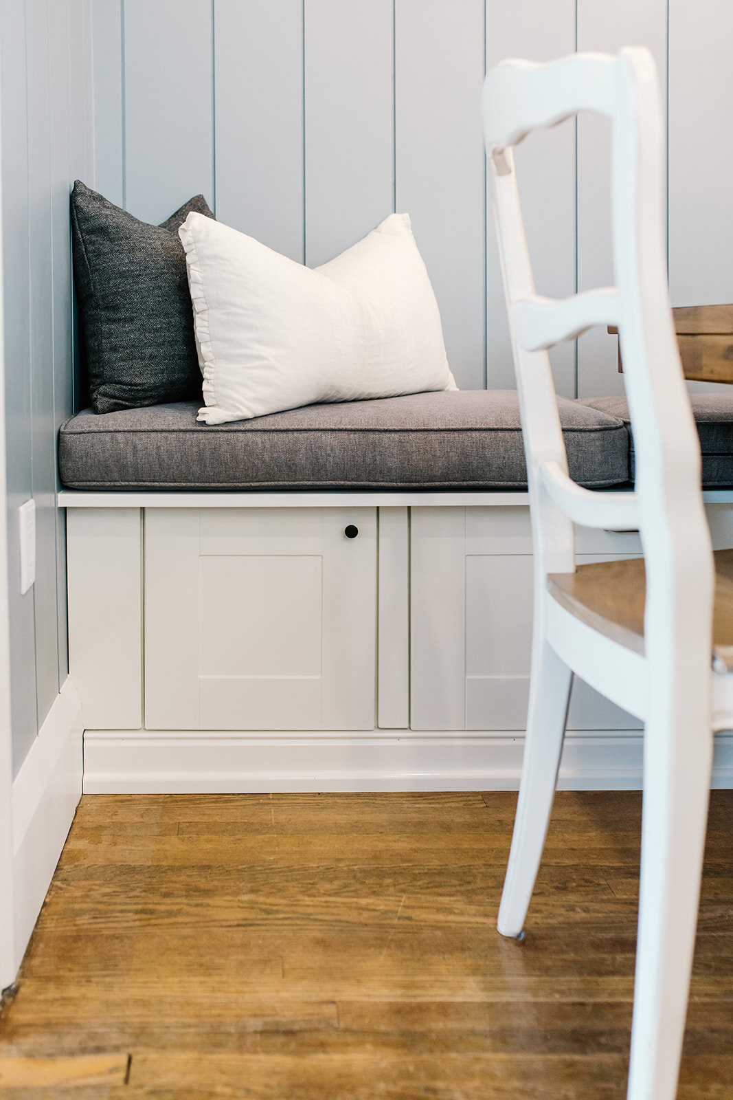
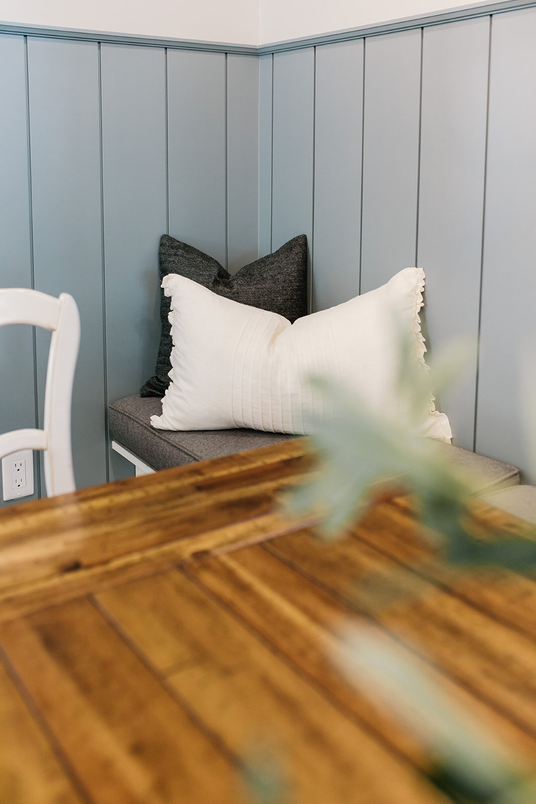
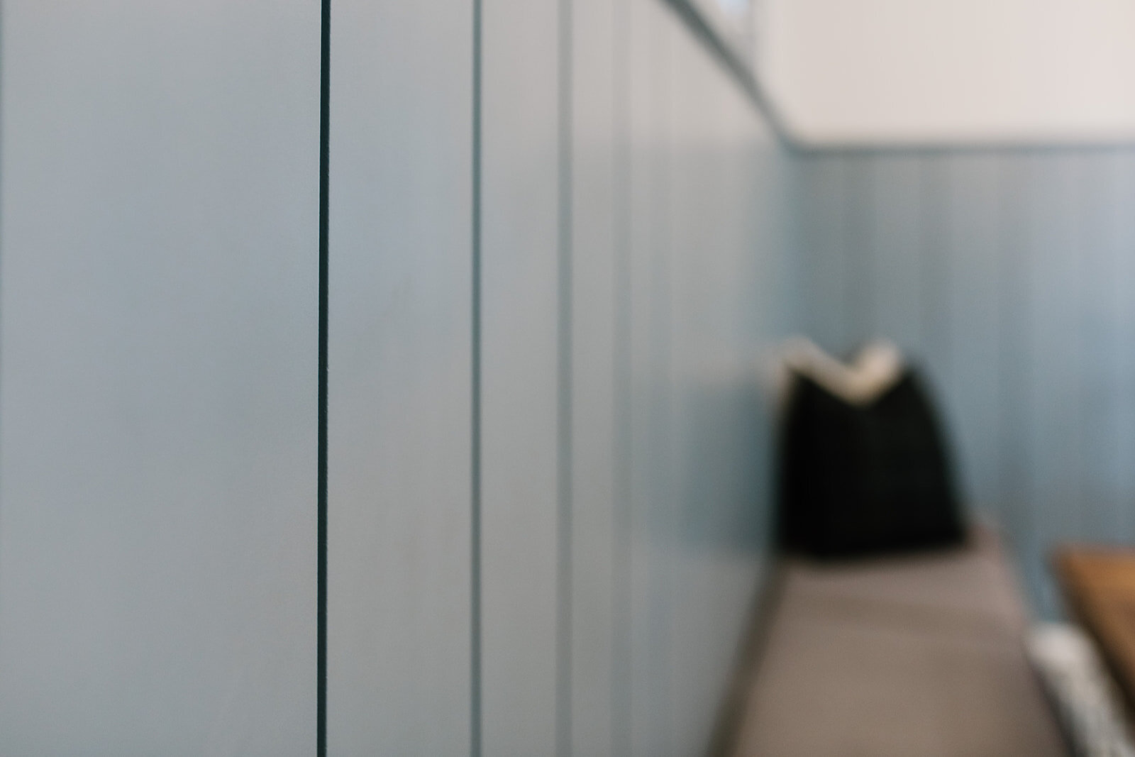
The dining room table and chairs are the homeowners’, but we moved everything closer to the window wall and added a built-in bench, also using IKEA cabinetry. The vertical shiplap above was painted in a blue-grey - a colour used throughout the rest of the home as well. This really helped to create a focal point for this room. We also painted the window trim in the same colour to carry it up.
The chandelier is a more traditional shape, which again, suits the style and era of the home.
The built-in bench area is probably my favourite part of this space. I love that it creates a more informal dining area and that the kids now have a cozy space to hang out while being present in the kitchen with mom and dad.
I’ll show you a few details of these spaces as well.
Thanks for letting me share this project with you!
If you have questions, feel free to leave a comment or get in touch with me.